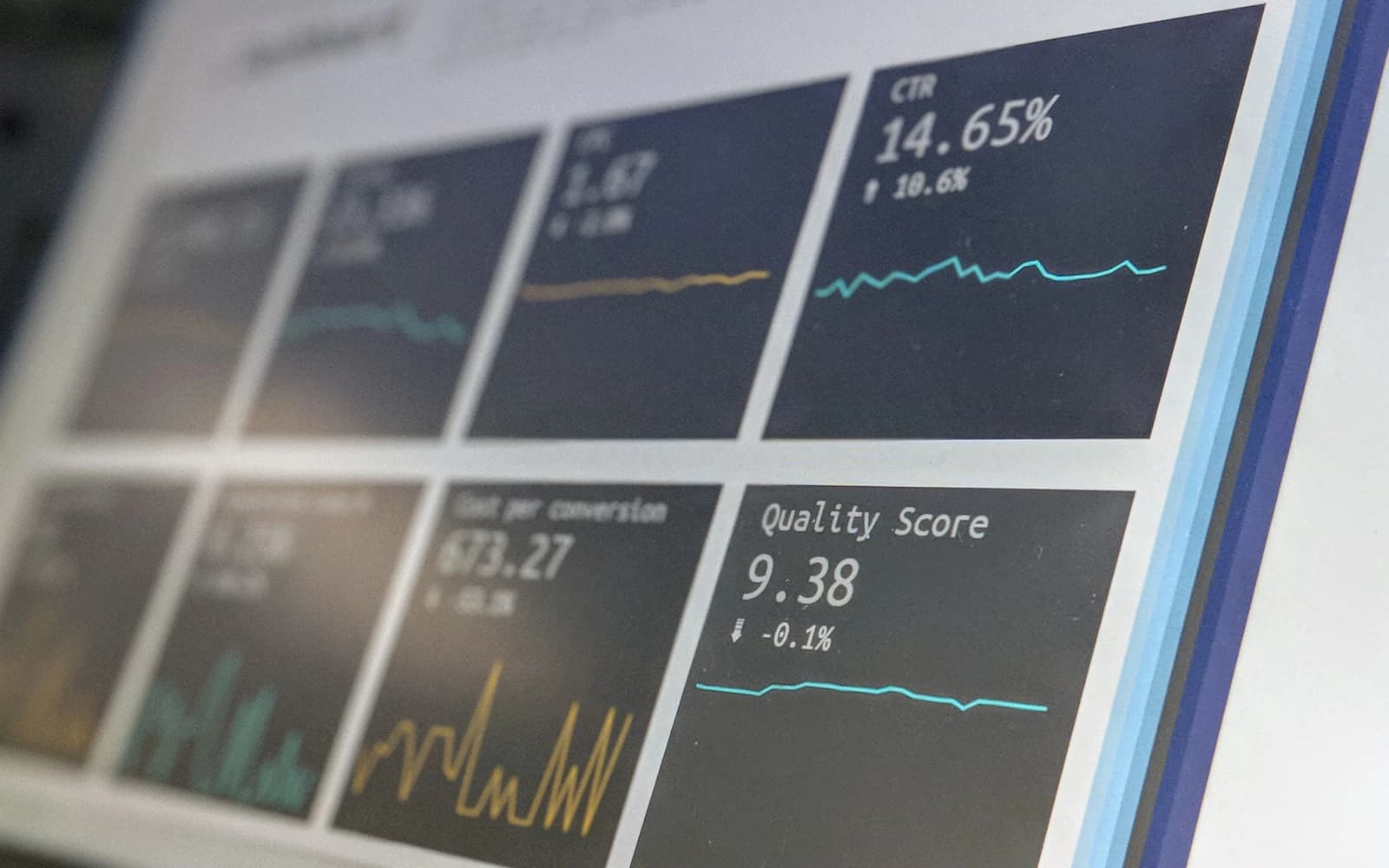
A useful dashboard shows whether an important outcome is on track, what changed, where to investigate and who should act. Start with the decision and its owner, then choose a small set of outcome, diagnostic and quality measures. Include definitions, comparison periods and data freshness so the reader can interpret the numbers correctly.
Many dashboards are accurate and still unhelpful. They show visits, enquiries, sales, tickets and response times, yet the meeting ends with someone asking for another spreadsheet. The problem is often the absence of a decision model.
This guide offers a practical structure for an operational or management dashboard. It applies to software products, service businesses and internal teams, whether the final view is a spreadsheet, a BI tool or a custom application.
- Choose the decision before choosing the chart.
- An outcome metric needs a denominator, a time period and a clear definition.
- Pair the desired improvement with a guardrail that reveals unintended harm.
Which decision is the dashboard supposed to support?
Name the reader and the action they can take. A support lead may redistribute a queue; a product manager may investigate failed onboarding; an owner may decide whether to add capacity. Those decisions need different information and different refresh rates.
Write a sentence before creating any charts: “Each weekday, the support lead uses this view to identify work at risk of missing its response target and assign an owner.” If the sentence cannot be completed, the dashboard’s purpose is still too broad.
GOV.UK’s service measurement guidance connects performance data with whether a service meets needs and allows people to complete tasks. For a business dashboard, the same principle is useful: measure the outcome people are trying to achieve, then choose diagnostics that help explain it.
How do you choose a small but useful metric set?
Use an outcome metric to describe the result, a diagnostic measure to locate the problem and a guardrail to check the cost of the response. For onboarding, the outcome could be successful account setup; a diagnostic could be failures at verification; a guardrail could be support requests from newly activated users.
Specify the denominator. “Completion rate” might mean completed tasks divided by started tasks, eligible users or all visitors. Those are different measures. Include the period and rules for repeated attempts, test activity and incomplete sessions.
Avoid an arbitrary rule that every dashboard needs exactly five or ten metrics. Keep only the measures that serve the intended decision. A detailed operational view can legitimately need more information than an executive summary.
| Dashboard layer | Question it answers | Illustrative measure |
|---|---|---|
| Outcome | Are people getting the result? | Completed bookings out of eligible booking attempts |
| Diagnosis | Where does the process break? | Availability lookup failures by location |
| Guardrail | Did the improvement cause harm? | Duplicate bookings and support contacts |
| Action | Who responds and when? | Named owner and next review date |
What makes a number interpretable?
A large number needs context. Show the relevant comparison, the reporting period and the last successful refresh. Where a target is displayed, explain who set it and why. A red indicator based on an invented target encourages confident but arbitrary reactions.
Choose comparisons that account for the way the business operates. Yesterday may be a poor comparator for a weekly cycle. A rolling trend can reveal direction, while the same weekday in a prior period can help interpret routine fluctuations. Neither removes the need to investigate campaigns or operational changes.
Show the sample size where percentages could mislead. One failed task out of two attempts produces a dramatic rate but little evidence of a broad regression. Avoid hiding uncertainty behind a decimal place.
How should readers move from a chart to an explanation?
Organise the view as a sequence: outcome, change, likely location, supporting records. A reader should not have to open five tabs to find the segment responsible for a change. Provide relevant filters and a route to inspect the underlying records, subject to their permissions.
Start with the most useful dimensions. Device, plan, office, process stage and customer cohort may explain a problem; dozens of rarely used filters can make it harder to see. Keep the default view aligned with the reader’s responsibility.
A dashboard can show an association, but it cannot automatically establish its cause. If mobile completion falls after a release, inspect the release and the affected journeys. Do not label the chart “new design caused lost sales” before investigating alternatives.
What does an actionable dashboard look like in practice?
Consider an illustrative installation business. Its existing dashboard celebrates enquiries received. The operations team actually needs to know which accepted jobs are at risk because the required site information has not arrived.
A more useful view starts with accepted jobs due soon, then separates jobs waiting on customer documents from jobs waiting on internal review. Each exception has an owner and a next action. The headline number now leads to work that can be done.
The dashboard should also reveal whether contacting customers earlier improves readiness without increasing duplicate messages or incorrect cancellations. This is a hypothetical example, not a SystemVale client outcome. The design principle is to connect visibility to an accountable operational response.
How do you stop attractive charts hiding bad data?
Validate the metric with people who understand the underlying process. Reconcile a sample of records to the source system and deliberately inspect awkward cases: a reopened ticket, a cancelled order, an imported lead or a transaction that crosses midnight.
Display stale or incomplete data honestly. A failed overnight refresh should not leave yesterday’s numbers looking current. Distinguish no activity from a failed data feed. Those states call for completely different actions.
GOV.UK’s guidance on setting performance metrics recommends choosing measures around service objectives. Extend that discipline to maintenance: when a process or objective changes, review the measure’s definition rather than keeping a familiar chart indefinitely.
What should happen after the dashboard launches?
Observe a real decision meeting. Ask the reader to explain the situation, identify the next investigation and choose an action using the view. If they still export everything first, find out what the dashboard does not yet make clear.
Keep a short decision log linking a notable change to the action taken and the later observation. This helps distinguish a frequently viewed dashboard from one that actually supports useful work. Avoid equating page views with business value.
Review unused charts, unclear definitions and recurring manual corrections. The most effective improvement may be removing a redundant view or fixing a data pipeline. SystemVale treats the interface and the measurement chain as one problem: both must support a decision that someone can explain.
Your next steps.
Write the reader, decision and review frequency in one sentence.
Define an outcome, a diagnostic and a guardrail.
Test the view in a real meeting and record what action it enables.
A little more clarity.
Does a dashboard need real-time data?
Only if the decision requires it and the underlying data supports it. A weekly planning decision rarely benefits from second-by-second updates. Match freshness to the action and show the actual refresh time.
Should executives and operational teams use the same dashboard?
They can share definitions and data while using different views. Executives usually need outcomes and trends; operational teams need exceptions, ownership and access to the records that require action.
How many KPIs should a dashboard have?
There is no universally correct count. Start with the smallest set that supports a named decision, explains meaningful changes and checks for unintended consequences. Add a metric only when its role is clear.
Check the sources.
Primary references for the technical guidance above. Checked 12 October 2026.
Written by SystemVale
Practical guidance on software, AI and automation across our five core practices.
Explore Analytics & Insights →